Are you a little shy when it comes to sharing about your business? Is it possible that the reason that you don’t want to share about your business is because you don’t like the way it looks?
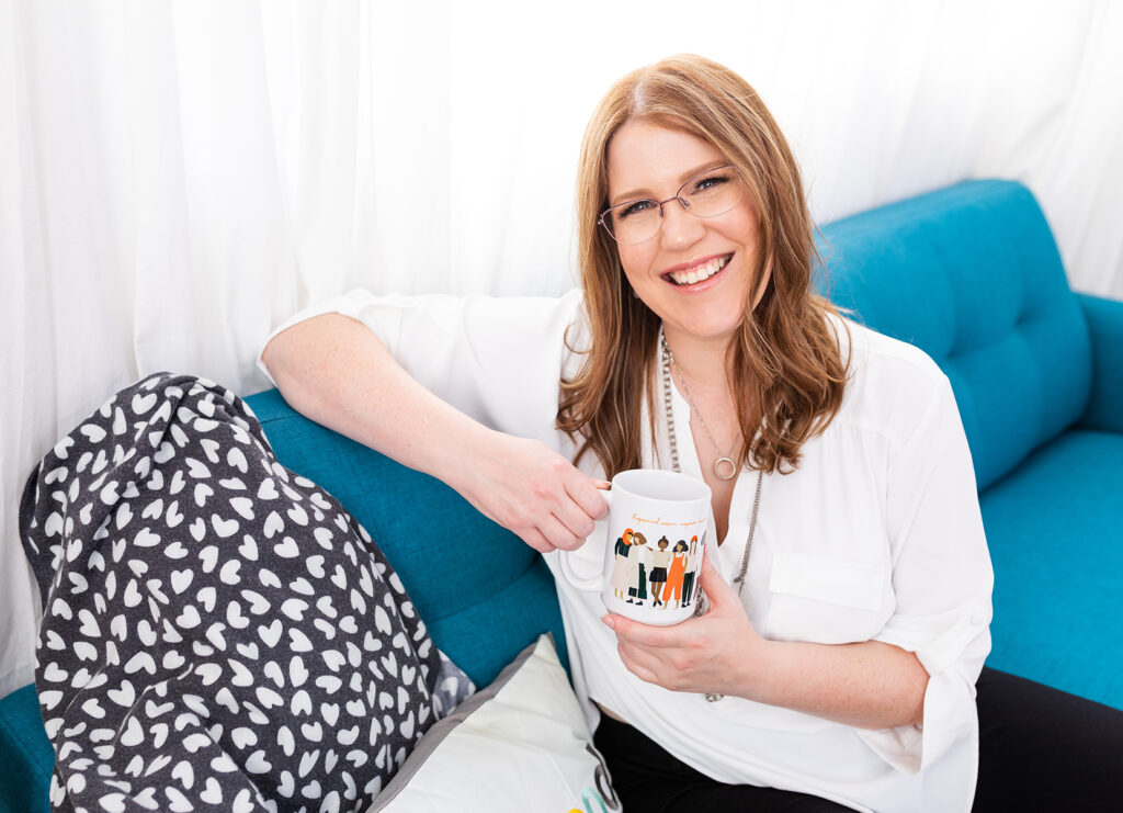
Christi Cooper, designer and creative strategist behind Cooper & Heart Creative, shares the important of web design for attracting clients and why you should be confident with sharing your brand.
Read on for key gems Christi shares.

The Intention of a Sales Page
A sales page is a tool that you can use to help people. You want a sales page that’s effective enough to stop getting on calls with people or stop having one to one conversations. Or you want to save time and book more people in the process.
You don’t need a sales page; you can make sales without one. A sales page is really when you’re looking at scaling what you’re offering, you’re tired of doing sales calls, or you’re building a fancy funnel. Your sales page is a salesperson but in a digital format. It’s like walking someone through a sales conversation without you having to actually talk to them one to one.
Why You Need Good Web Design and Copy
Design and copy go hand in hand. You can have really good copy, but if your design is awful, people won’t read it. But if your design is pretty or it looks nice and your copy is confusing and unclear, people won’t read it. So you need both good copy and good design.
Design is about the experience that connects emotional feelings because people are visual creatures and connect on a visceral level to colors, fonts, and styles. People actually want to read your copy versus having a headline and then a block of paragraph. People just skim the page, whether it’s a shorter page or longer page. So you really need to break up that copy. And that’s what design does. It’s also a lot of designing that text in a way that makes it easier for people to take it in.

3 Mistakes to Avoid When DIYing Your Website
Having a Busy Design
Having a design that is too busy – more graphics, backgrounds, and information is something you want to avoid. Clients are overwhelmed and it’s not clear. Also, not having compelling copy at the beginning of the page will have a hard time pulling people in and connecting with them and pull them into the copy.
Not Creating a Mobile View
Another mistake is forgetting about creating a mobile view. While your website looks good on a desktop, once people try to view it on their phones, things are overlapping and the text is all crazy and people can’t read this. That’s not good, because a huge percentage of people view sales pages on mobile devices.
Not Having an Obvious Call to Action Button
You should make sure your buttons stand out and have enough of them so that when people are ready to say yes, they can click that button. And it should be really obvious. For example, using an accent color that contrasts with the rest of the color palette or make it a big button. You also want it at the top of the page for people who are returning. So either in the header bar or under the copy there, because people will revisit sales pages, especially when they’re ready to make the decision. Always make sure you have one at the bottom of the page so you want a very last call to action at the bottom.

How You'll Know When It's Time To Hire a Designer
When you at the point where you don’t have time or don’t want to update or create your website yourself, is the perfect time to outsource your web design. Another time is when you’re looking to scale your business. When you’re ready to level up your website look and the experience that people have on it so that I can convert more people when they see the page, is when you should outsource your web design.
Resource
33 Expert Design Tips for Websites & Sales Pages that Sell – desoladavis.com/33tips
About Christi
Christi Cooper is the designer and creative strategist behind Cooper & Heart Creative where she helps coaches and service-providers level up their brands with beautiful, conversion-focused sales pages and websites they LOVE to share.

